Increasing sales by improving product presentation and trust signals

Lomi is a Swedish natural pet care brand for pets, selling 10 products in 100+ stores worldwide.
This project focused on increasing sales on Lomi's own website.
User Research · E-commerce UX · Conversion Optimization · Trust & Decision-Making · Data-Informed Design

Overview
Objective
Improving product presentation and trust signals on Lomi's website to help users make confident purchase decisions and increase online sales across the EU.
My Role
- UX & UI Designer
- User Research
- Usability Testing Behavioral Analysis
- Data-Informed Design
Tools
Figma, Hotjar, Session replay, Interview, Useability test
Duration
- • 4 weeks
- • Winter 2025
Project in a glance
- First-time users lacked confidence to buy:
Most traffic came from new visitors, increasing hesitation and drop-off.
- Unclear trust and value signals:
Reviews and credibility cues were present but not noticeable or engaging.
- Bundle-heavy layout increased friction:
Business focus on bundles added visual complexity and slowed decision-making.
- No clear pain point in the brief:
UX research was needed to uncover hidden friction and trust gaps.
- Reprioritized product page content:
Surfaced core benefits, ingredients, and social proof early to support first-time users.
- Strengthened trust signals:
Improved review visibility to make credibility obvious and actionable.
- Simplified bundle presentation:
Reduced visual noise to support faster comparison and clearer choices.
- Placed key decision cues near Add to Cart:
Highlighted free shipping and reassurance points to reduce cognitive load and increase confidence.
Process
- •Competitor Analysis
- •Founders Interview
- •UX audit test
- •Test hypothesis with survey
- •Interview with pet owners
- •5 second test
- •Session replay analysis
- •Heat map Analysis
- •User journey mapping
- •Test hypothesis with survey
- •UI design
- •Present

Case Study
Discovery
I began by understanding the product, business goals, and current website performance.
Since most traffic came from first-time users, my initial assumption was that stronger trust signals would increase sales.
Initial Hypothesis
How might we present products so that user trusts the products and brand?
- · Desk research (similar pet e-commerce brands)
- · Heuristic evaluation (Nielsen & Norman principles)
- · Founder interviews
- · Bundle selling was a key business goal
- · Ingredients were an important trust signal for users
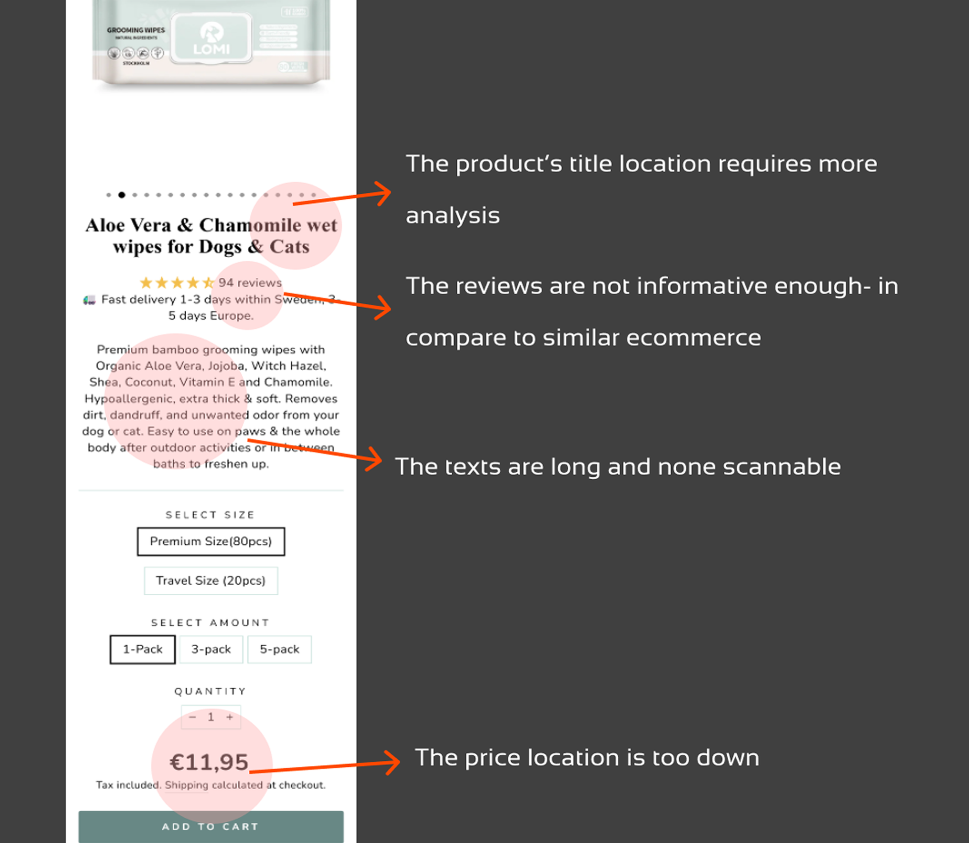
- · The product page showed potential UX issues: text-heavy descriptions and not enough informative reviews.
What if trust wasn't missing—but not clearly communicated?
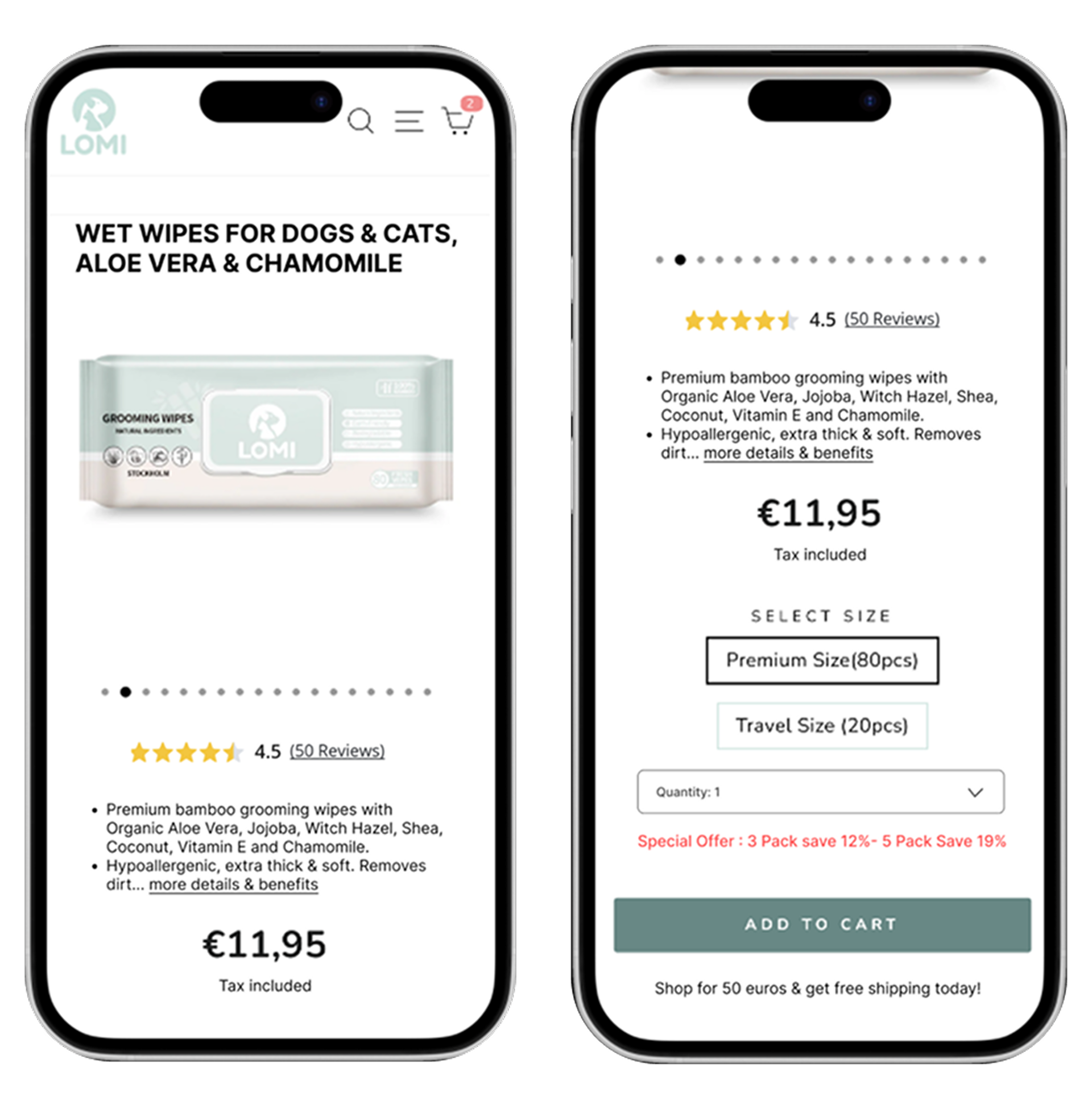
I decided to focus on the product page as the main decision-making surface.
Behavioral Research & Insights:
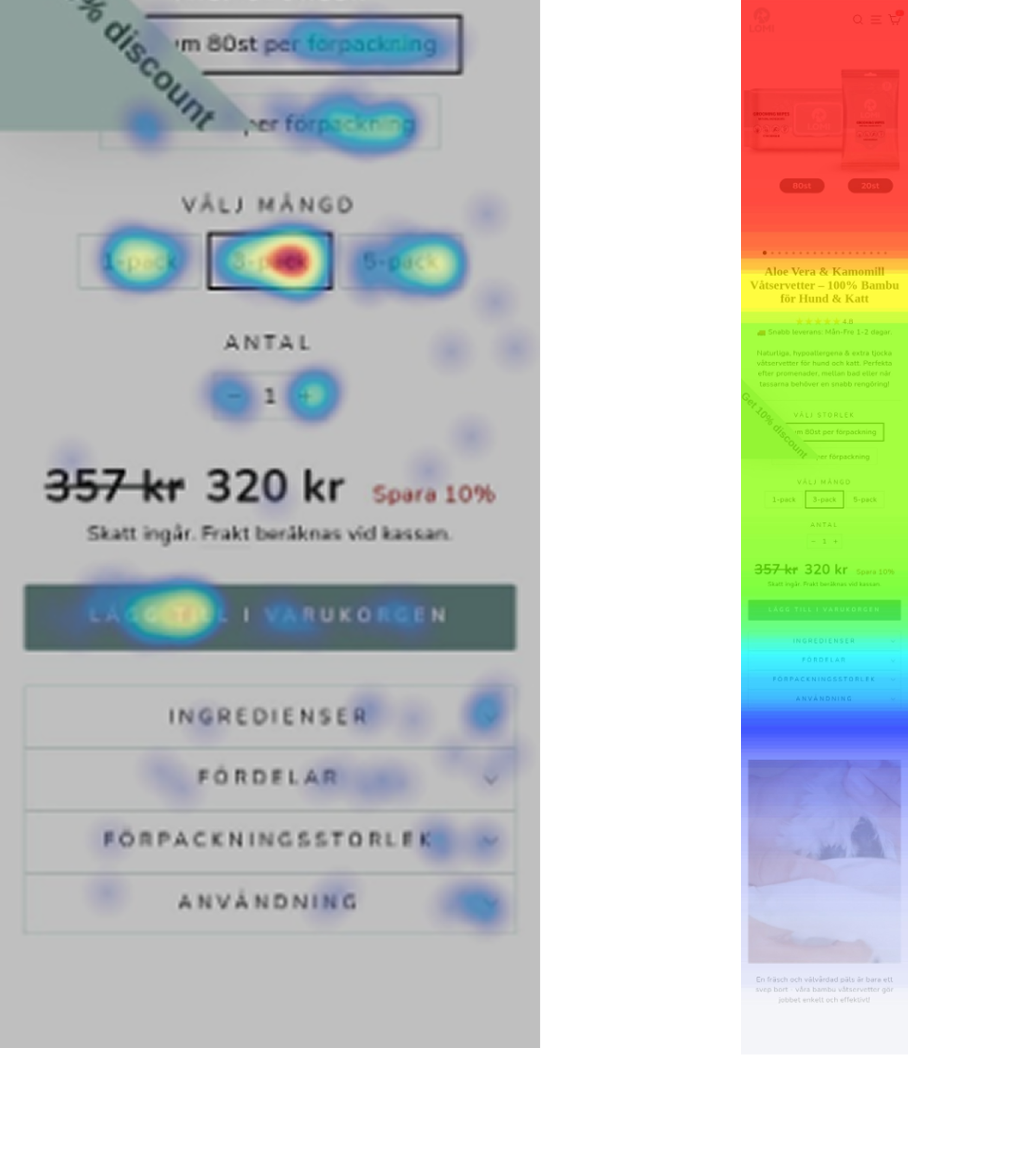
To understand how users actually interact with the product page, I studied user behavior through the interaction with the website.
- · 5-second test (early directional input)
- · Heatmaps, scroll depth, click maps, attention maps
- · 30 session replays analysis
- · As-is user journey mapping
- · Bundle CTAs received the highest clicks
- · Bundle section had -20 seconds of attention time, could be a confusion rather than healthy engagement
- · Page exit rate was -53%
- · Reviews had almost no interaction
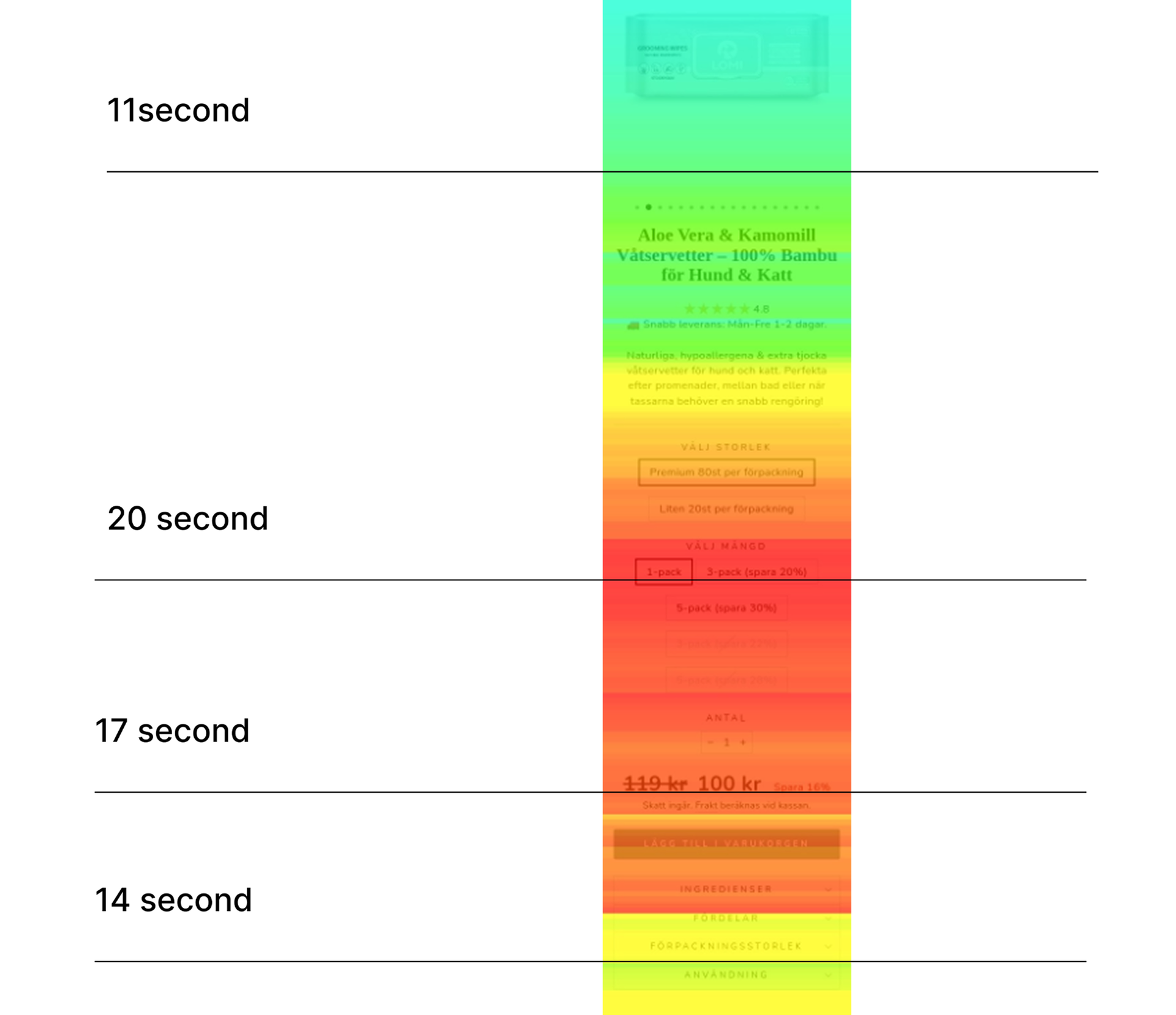
Product Page Heat map analysis:
Session replay analysis and User journey mapping:
After analyzing 30 session replays, I mapped recurring user behaviors into an AS-IS user journey map to understand real-life interactions, identify friction points, and see how users overcome obstacles to reach their goals.
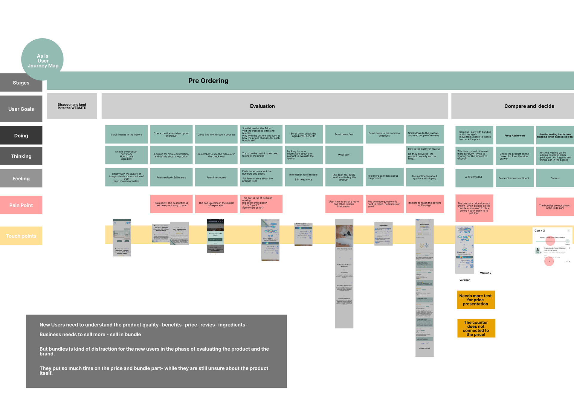
- · Users scanned images, skipped descriptions and reviews, and searched for price.
- · They interacted heavily with bundles, comparing prices and doing mental calculations.
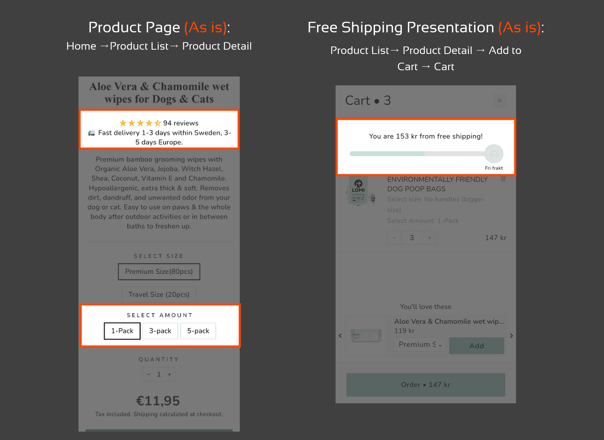
- · After adding to cart, users noticed the free shipping threshold and returned to the product page to adjust their choice.
At this stage I came up with two questions:
What if bundle purchasing is not a new users' behavior?
Is the free shipping offer can affects users' decision?
Survey to test users' behavior in their first time purchase
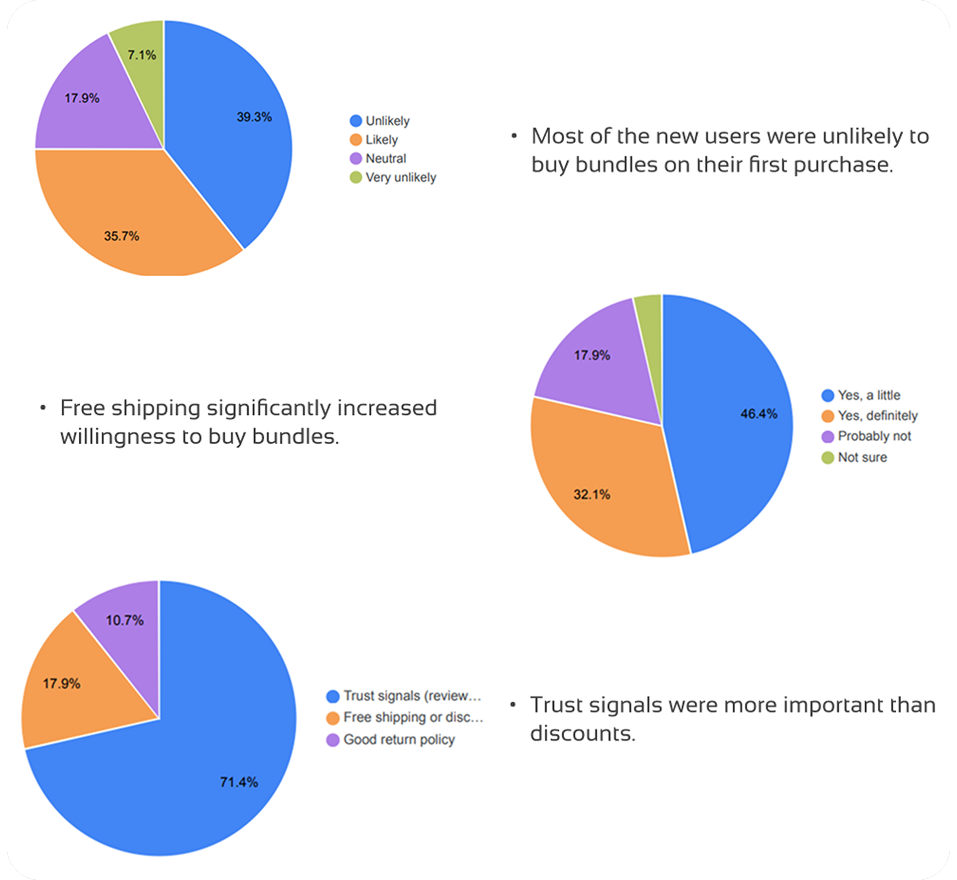
- · Most of the new users were unlikely to buy bundles on their first purchase.
- · Free shipping significantly increased willingness to buy bundles in their first purchase.
- · Trust signals were more important than discounts for users.
Design Direction
These insights led to clear design decisions:
Design Principles:
- ·Keep bundles, but reduce their visual dominance
- ·Improve trust signals, especially review presentation and product ingredients.
- ·Surface free shipping near key decision points (Add to Cart)

Design Result
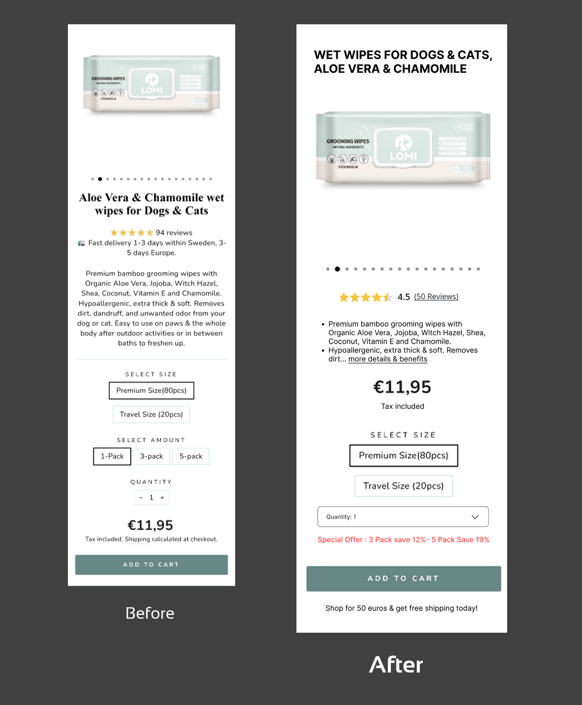
The final UI focused on:
- ·Clear information hierarchy
- ·Less distracting bundle presentation
- ·More visible and informative reviews
- ·Short and scannable product description
- ·Surface free shipping near key decision points (Add to Cart)
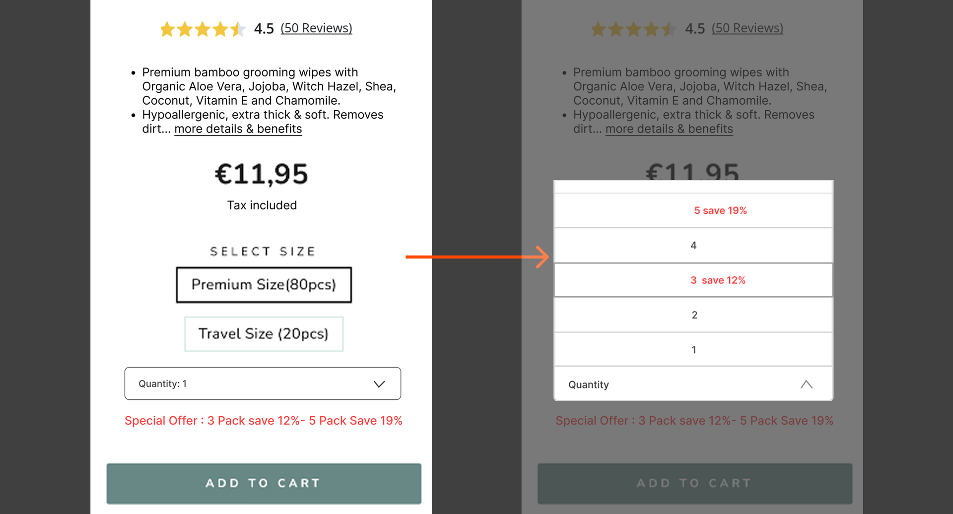
Bundle presentation redesign:
- ·Presenting the bundles by drop down menu.
- ·Helps us display bundles without distracting users from key information on the page.
- ·Emphasize the special discounts with red color.